From Builder-Grade to Boutique: The Art Niche Glow-Up
The “Awkward Arch” Dilemma
We’ve all seen them—those recessed, arched niches common in many homes built over the last two decades. While they are intended to add architectural interest, they often end up as “dust collectors” or awkward voids that leave homeowners scratching their heads. For a long time, our hallway niche sat empty, a beige-on-beige reminder of “builder-grade” design that lacked personality and purpose.
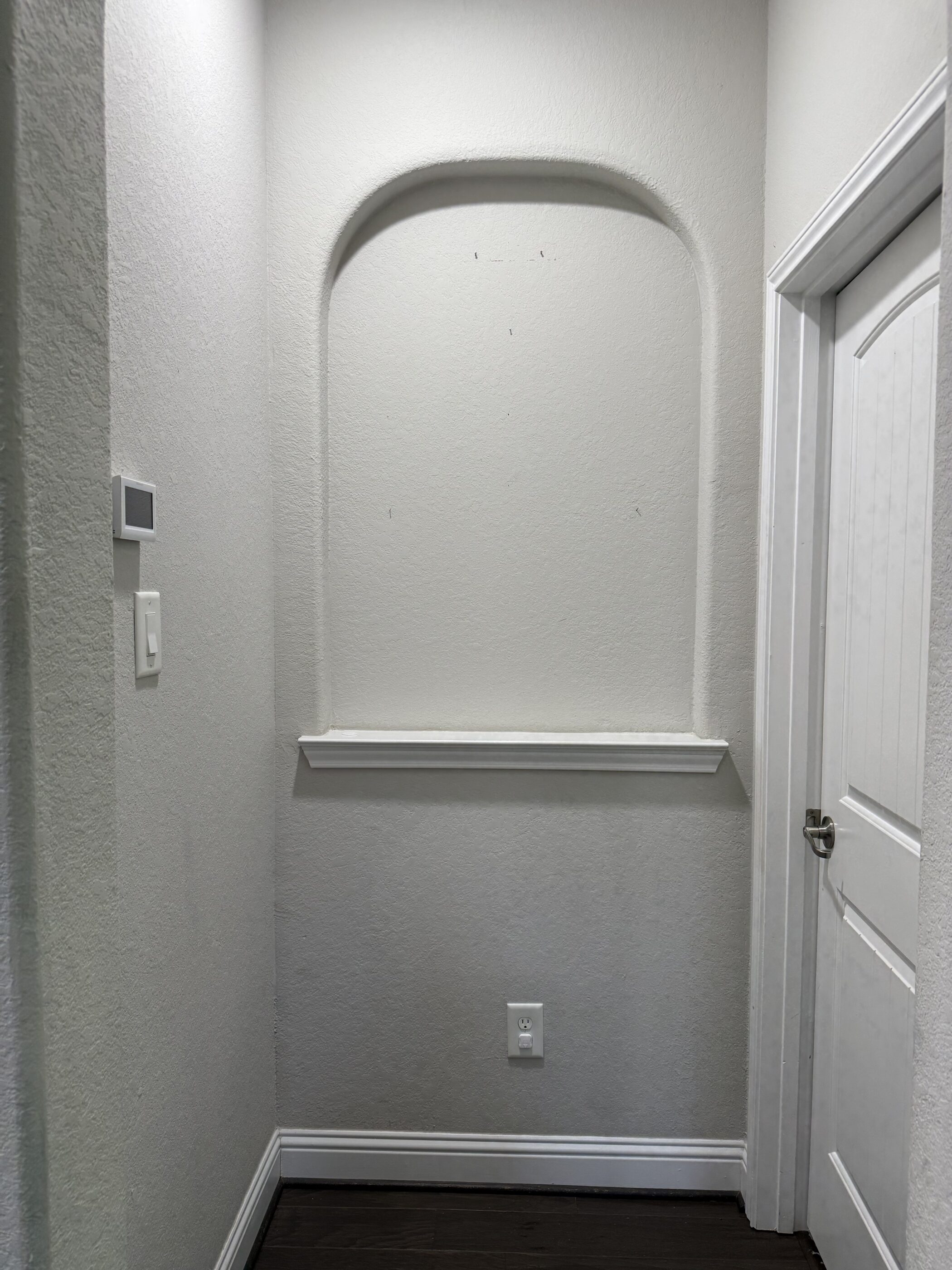
The “before” was a blank canvas in the most literal sense. It had the standard white sill, neutral paint, and an outlet at the bottom that felt more like an eyesore than a utility. However, the architecture itself had potential. The curve of the arch provides a natural frame; it just needed the right elements to make it “pop” and feel like an intentional design choice rather than a leftover construction detail.
The Transformation Strategy
The goal of this “glow-up” was to create a focal point that felt curated rather than cluttered. Instead of filling the shelf with small knick-knacks or a single tiny candle, we decided to utilize the vertical space of the recessed wall. When you are dealing with a niche, the biggest mistake you can make is ignoring the height.
-
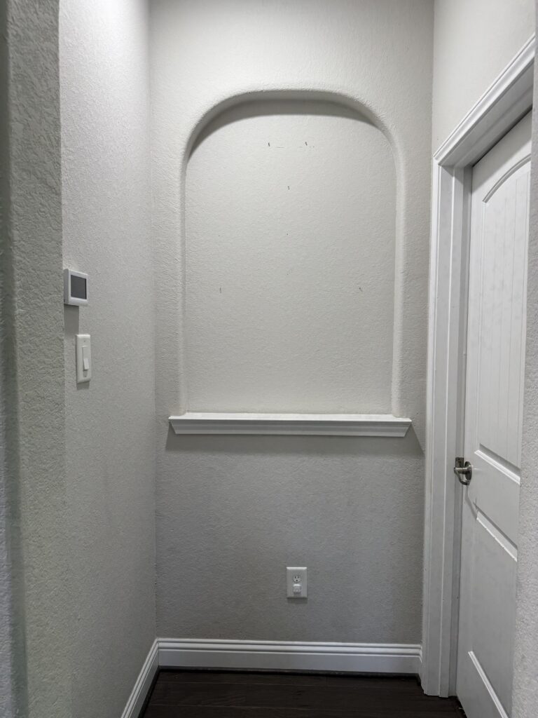
- A before photo of an empty niche in a home
1. The Power of “Stacked” Art
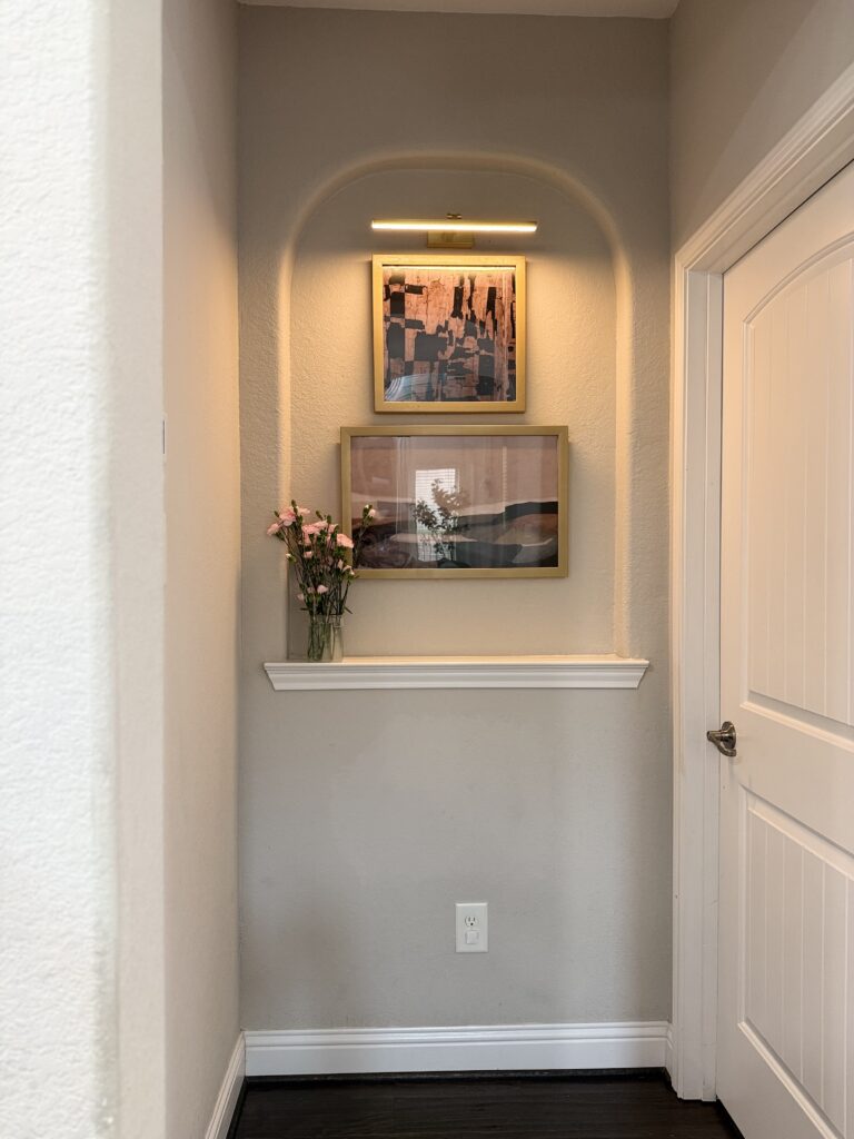
Rather than hunting for one giant, expensive piece of art to fit the arch, we opted for a “stacked” look. We chose two pieces with a cohesive color palette—warm terracotta, soft pinks, and bold black accents. By using gold frames, we added a touch of metallic warmth that contrasts beautifully with the cool-toned walls.
Stacking the art vertically does something magical: it fills the height of the arch perfectly, drawing the eye upward and making the ceilings feel much higher. It creates a sense of balance and sophisticated “fullness” that a single piece might have missed.
-
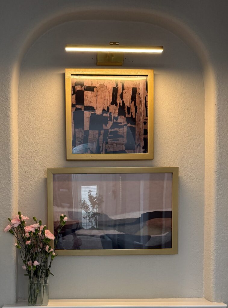
- After photo of a decorated arched wall niche with stacked gold-framed art and a brass picture light
2. Let There Be Light (The Game Changer)
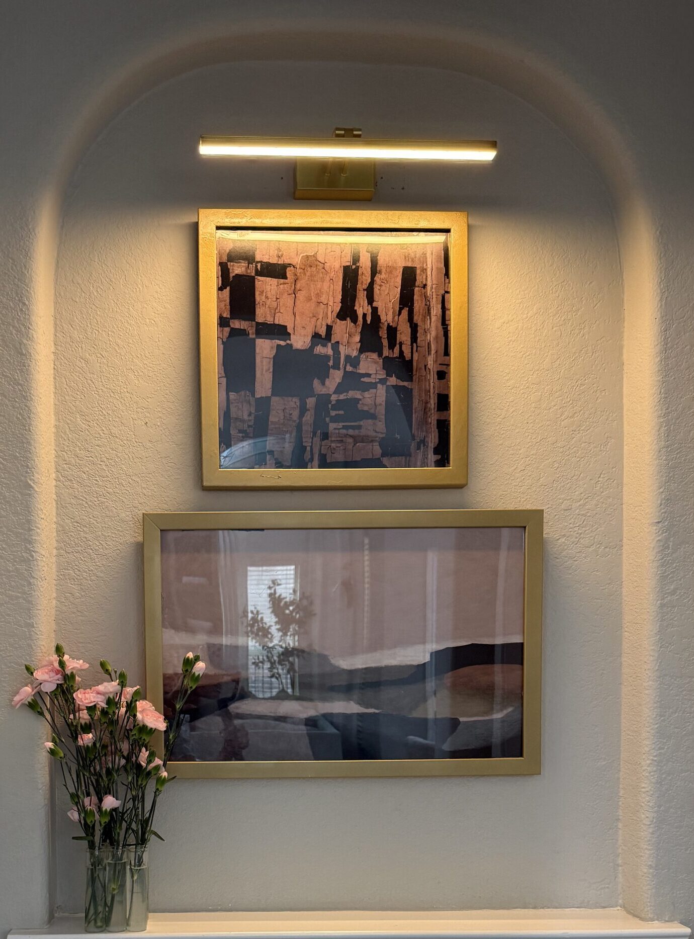
Lighting is the “secret sauce” of interior design. We installed a sleek, brass picture light at the very top of the arch. This does two things: it highlights the texture of the artwork and physically “fills” the empty void of the curve.
Because there was already an outlet below, it makes using a battery-operated light (or even hardwiring a permanent fixture) much easier. The warm glow instantly elevates the hallway from a simple transition space to a high-end gallery experience. It turns a dark corner into a warm, inviting beacon of light in the evening.
3. Softening the Edges with Greenery
The final touch was a simple glass vase of fresh pink carnations on the ledge. In any “hard” architectural space—where you have drywall, wood frames, and glass—you need a bit of organic life to break things up. The greenery and soft petals add a lived-in, fresh feel. It breaks up the straight lines of the frames and the sill, adding a third dimension to the display.
Final Thoughts: Make Your Architecture Work for You
This transformation proves that you don’t need a full-scale renovation or a sledgehammer to change the vibe of your home. By focusing on lighting, scale, and color, we turned a forgotten architectural feature into the most talked-about spot in the house.
If you have an empty niche in your home, stop ignoring it! Treat it like a miniature stage. Whether it’s a collection of vintage books, a single striking sculpture, or a stacked art gallery like ours, give that space a purpose.
Ready to transform those builder-grade niches your home?
Serving The Woodlands, Magnolia, Montgomery, Cypress, Sugar Land, Richmond & Greater Houston
At Emma’s Interior, we specialize in designing entryways that work as hard as they look good.
Contact me to discuss your project Follow along for more design inspiration and color guidance